
CURATOR'S NOTE

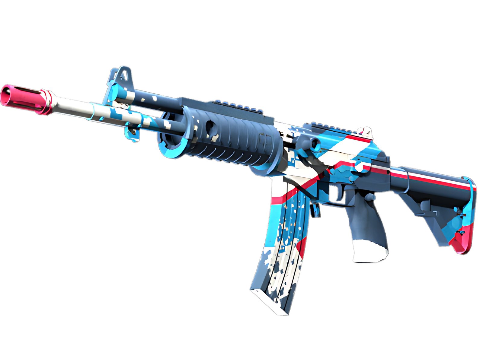
Rocket Pop reads immediately because the palette is organised rather than scattered. Blue takes the visual lead; White anchors it; Red supplies the smaller counterpoint that makes the finish memorable. On the Galil AR, that balance follows this specific finish treatment especially well.
DETAILS / CLOSE-UP
MAIN GESTURE
On the Galil AR, the receiver and handguard carries most of the Blue; in Rocket Pop, this becomes the first area the eye reads and the clearest expression of the finish.
QUIETER SUPPORT
Across the stock, Rocket Pop uses White to interrupt the main field. On this Galil AR, that break gives the illustrative artwork enough rhythm to stay legible.
FINAL ACCENT
At the magazine and lower line, Rocket Pop becomes quieter. Red and the underlying material define the boundary between painted surface and the Galil AR's functional geometry.
PALETTE
 Blue
Blue
 Red
Red
 White
White
STYLE
 Artistic / Expressive
MOOD
 Aggressive / Entry
 Flashy / Show-Off
SKIN PROFILE
RATING

VERDICT
Efficient Pick Cot Cot!