
CURATOR'S NOTE

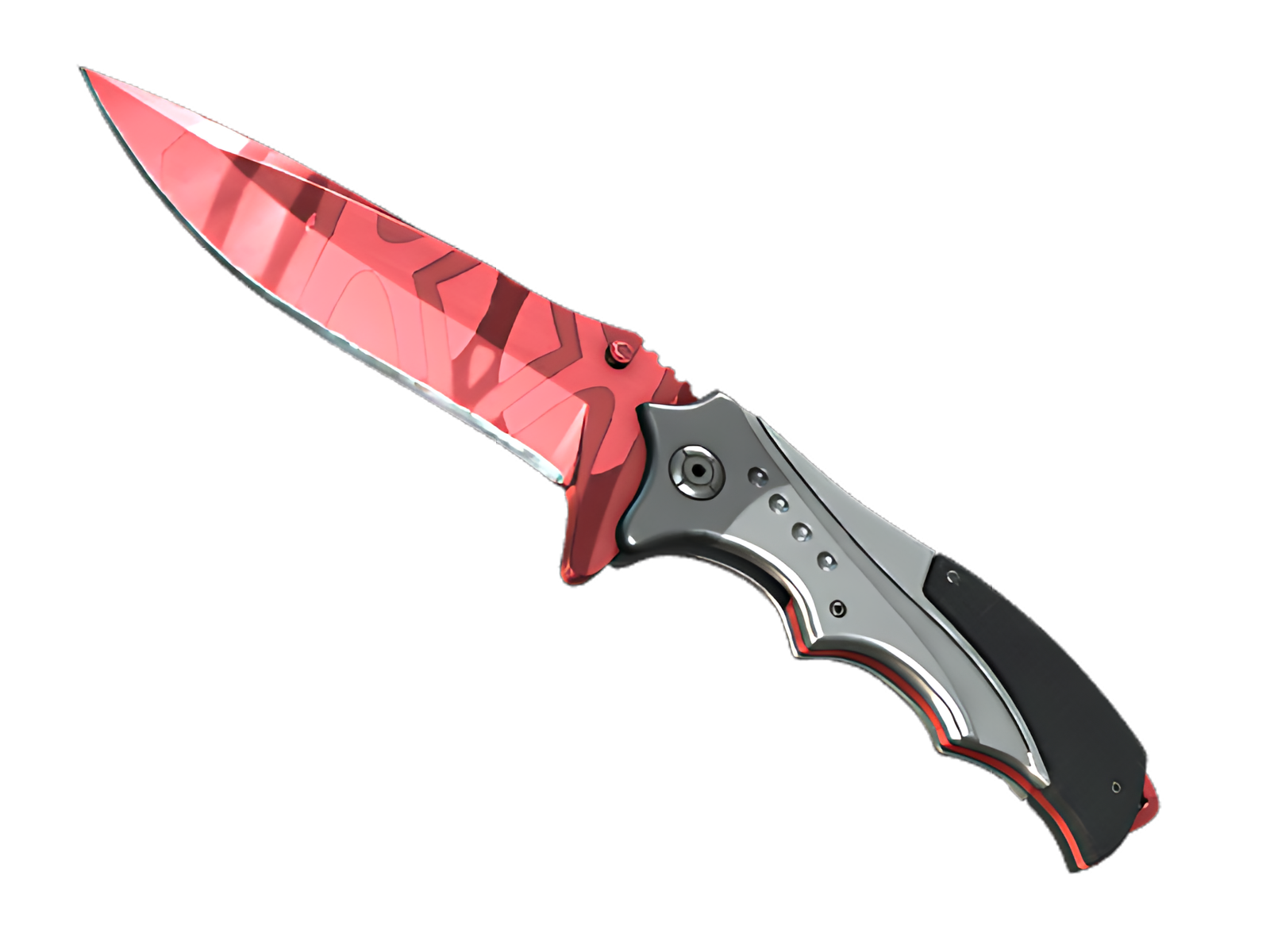
The appeal of Slaughter comes from how deliberately its surface treatment is distributed across the ★ Nomad Knife. Rather than spreading every colour evenly, the finish lets Red dominate and uses Black to articulate the ★ Nomad Knife's major breaks. That balance keeps the finish coherent from first read to close-up inspection.
DETAILS / CLOSE-UP
SURFACE FOCUS
Across the blade face, Slaughter concentrates most of the Red. This is where the red-on-steel abstract pattern reads most clearly and where the ★ Nomad Knife gains its first visual anchor.
STRUCTURAL BREAK
Moving into the spine and cutting edge, Black interrupts the main field just enough to separate the surfaces. That pacing is what keeps Slaughter readable on the ★ Nomad Knife.
FINAL ACCENT
Near the handle and pommel, the finish steps back. the exposed material becomes the final accent, allowing the ★ Nomad Knife's physical construction to close the composition. On this ★ Nomad Knife, that role is specific to Slaughter.
PALETTE
 Black
Black
 Red
Red
STYLE
 Artistic / Expressive
 Minimalist / Clean
MOOD
 Aggressive / Entry
 Flashy / Show-Off
SKIN PROFILE
RATING

VERDICT
Finger Lickin' Clean!