CURATOR'S NOTE

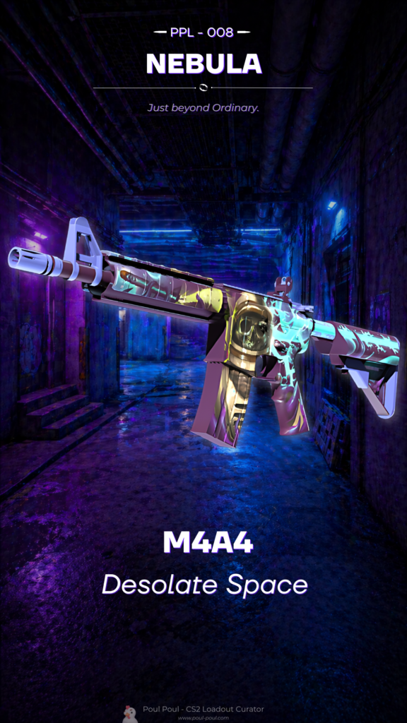
What makes Desolate Space convincing is the relationship between colour, material and the M4A4's underlying geometry. The Blue passages establish the first read, while Pink controls the separation between sections; the surface-specific graphic treatment provides the identity. The result feels balanced and deliberate: recognisable at a glance, but detailed enough to reward a closer look.
DETAILS / CLOSE-UP

DOMINANT PASSAGE
Across the receiver and handguard, Desolate Space concentrates most of the Blue. This is where the surface-specific graphic treatment reads most clearly and where the M4A4 gains its first visual anchor.
PATTERN CONTROL
Moving into the stock and magazine, Pink interrupts the main field just enough to separate the surfaces. That pacing is what keeps Desolate Space readable on the M4A4.
MATERIAL DEPTH
At the barrel assembly and exposed hardware, Purple and the underlying construction become more visible. The quieter treatment frames the painted areas instead of competing with them. On this M4A4, that role is specific to Desolate Space.
PALETTE
 Blue
Blue
 Pink
Pink
 Purple
STYLE
 Artistic / Expressive
MOOD
 Clutch / Cold-Blooded
 Flashy / Show-Off
SKIN PROFILE
RATING

VERDICT
Finger Lickin' Clean!