
CURATOR'S NOTE

The Empress is not trying to be universally attractive. It is trying to make regal tarot-card-like portrait framed by red, royal blue and gold ornament convincing. That visual story would be weaker on a flat paint job; illustrated card art and filigree gives it texture, depth and a sense of construction. That is why it deserves its own composition rather than a copy-pasted description built from palette tags.
DETAILS / CLOSE-UP
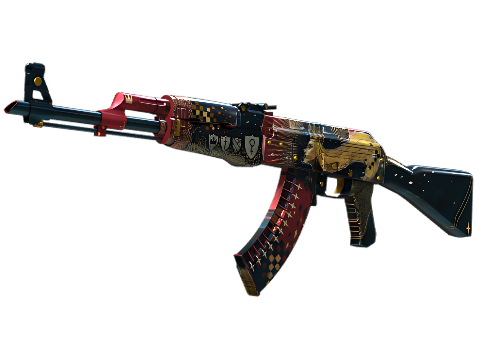
CENTRAL EMPRESS FIGURE
Central Empress figure. The visual effect is strongest where the motif meets an unpainted or darker component, because that boundary makes both sides clearer.
GOLD BORDER STRUCTURE
Gold border structure. That one decision changes the perceived material of the weapon more than an extra illustration would.
RED-BLUE ROYAL FIELD
Red-blue royal field. The feature is effective because it belongs to a logical part of the object rather than floating across arbitrary surfaces.
PALETTE
 Black
Black
 Brown
Brown
 Red
Red
STYLE
 Artistic / Expressive
MOOD
 Clutch / Cold-Blooded
 Flashy / Show-Off
SKIN PROFILE
RATING

VERDICT
Certified Cluckin' Banger!