
CURATOR'S NOTE

The first read of Bamboo Print is colour: Beige leads, Grey gives it structure, and the finish turns that contrast into organic surface pattern. It is a finish that works through composition first, spectacle second.
DETAILS / CLOSE-UP
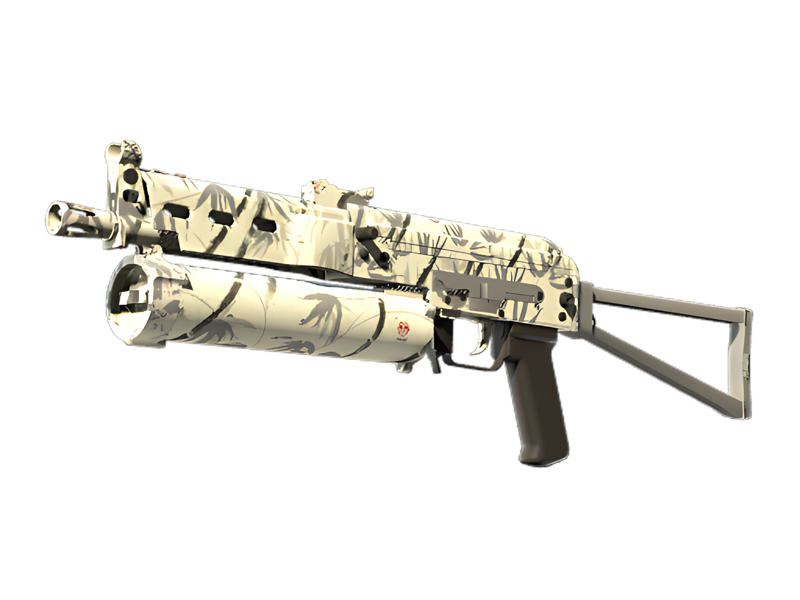
NATURAL RHYTHM
Across the main body, Beige is broken by Grey, creating the clearest rhythm in the composition.
DARK STRUCTURE
The contrast between Beige and Grey gives the finish its edge, especially where painted sections meet darker hardware. For Bamboo Print on PP-Bizon, this is part of the finish's specific visual balance.
SURFACE DEPTH
The organic surface pattern gains depth from the way highlights and darker recesses move across the render, preventing the palette from feeling flat. For Bamboo Print on PP-Bizon, this is part of the finish's specific visual balance.
PALETTE
 Beige
Beige
 Grey
Grey
 White
White
STYLE
 Geometric / Pattern
 Natural / Camo
MOOD
 Clutch / Cold-Blooded
 Defensive / Anchor
SKIN PROFILE
RATING

VERDICT
Efficient Pick Cot Cot!