
CURATOR'S NOTE

Rather than treating the Survival Knife as one continuous canvas, Slaughter uses its separate surfaces deliberately. The result is a finish where Red feels intentional, supported by Black and the darker structural parts. On the Survival Knife, that balance follows this specific finish treatment especially well.
DETAILS / CLOSE-UP
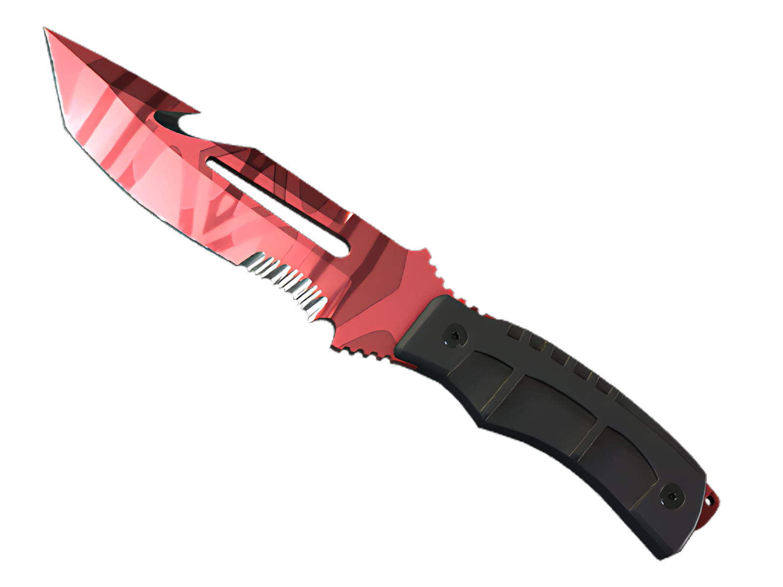
PRIMARY FIELD
On the Survival Knife, the blade face carries most of the Red; in Slaughter, this becomes the first area the eye reads and the clearest expression of the finish.
COLOUR BREAK
Across the spine and tip, Slaughter uses Black to interrupt the main field. On this Survival Knife, that break gives the graphic pattern enough rhythm to stay legible.
MATERIAL EDGE
At the handle transition, Slaughter becomes quieter. the darker structural parts and the underlying material define the boundary between painted surface and the Survival Knife's functional geometry.
PALETTE
 Black
Black
 Red
Red
STYLE
 Geometric / Pattern
MOOD
 Aggressive / Entry
 Flashy / Show-Off
SKIN PROFILE
RATING

VERDICT
Finger Lickin' Clean!