
CURATOR'S NOTE

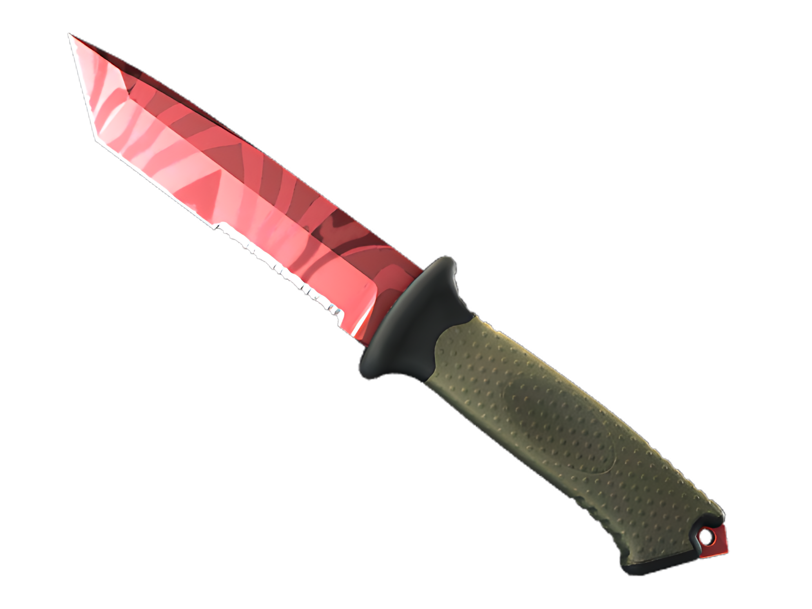
What makes Slaughter convincing is the relationship between colour, material and the ★ Ursus Knife's underlying geometry. The Red passages establish the first read, while Black controls the separation between sections; the red-on-steel abstract pattern provides the identity. Because the visual weight is controlled, the finish remains easy to place inside a curated loadout.
DETAILS / CLOSE-UP
PRIMARY FIELD
Across the blade face, Slaughter concentrates most of the Red. This is where the red-on-steel abstract pattern reads most clearly and where the ★ Ursus Knife gains its first visual anchor.
SECONDARY RHYTHM
The spine and cutting edge introduce Black as a counterweight. On Slaughter, that shift prevents Red from flattening the design and gives the high-gloss metallic blade a more deliberate rhythm.
MATERIAL BREAK
The handle and pommel act as a visual release point: the exposed material and exposed material reduce the density of Slaughter and sharpen the boundary between finish and hardware. On this ★ Ursus Knife, that role is specific to Slaughter.
PALETTE
 Black
Black
 Red
Red
STYLE
 Artistic / Expressive
 Minimalist / Clean
MOOD
 Aggressive / Entry
 Flashy / Show-Off
SKIN PROFILE
RATING

VERDICT
Finger Lickin' Clean!