
CURATOR'S NOTE

On this silhouette, Akihabara Accept uses large anime heroine framed by pink-blue-white packaging and magazine-like graphics to change how the AUG feels without changing its form. The mechanical interruptions are useful here: they make anime illustration and commercial print design feel installed, layered or applied with intent. The best loadouts will amplify one or two of these cues rather than duplicate the whole finish.
DETAILS / CLOSE-UP
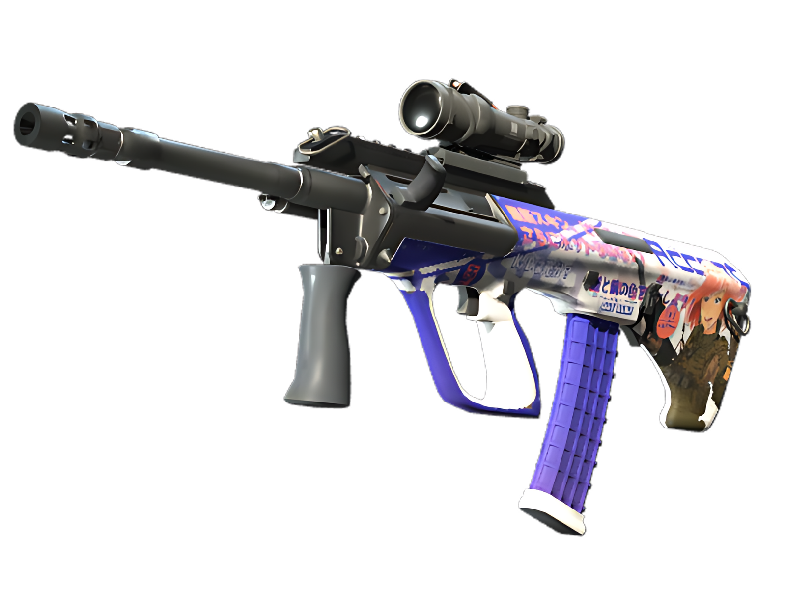
CHARACTER PORTRAIT
Character portrait. On the AUG, that choice controls the first visual read before any smaller graphics become visible.
JAPANESE PACKAGING GRAPHICS
Japanese packaging graphics. Its direction follows the AUG's body, so the composition reads from front to back as one object.
PASTEL-POP FIELD
Pastel-pop field. This zone carries enough weight to define the finish without asking every other section to be equally loud.
PALETTE
 Black
Black
 Blue
Blue
 Grey
Grey
STYLE
 Artistic / Expressive
MOOD
 Aggressive / Entry
 Flashy / Show-Off
SKIN PROFILE
RATING

VERDICT
Finger Lickin' Clean!