
CURATOR'S NOTE

What makes Storm work is not complexity for its own sake, but the balance between controlled surface treatment and a high-contrast colour structure. That gives the skin a distinct identity without forcing every surface to compete.
DETAILS / CLOSE-UP
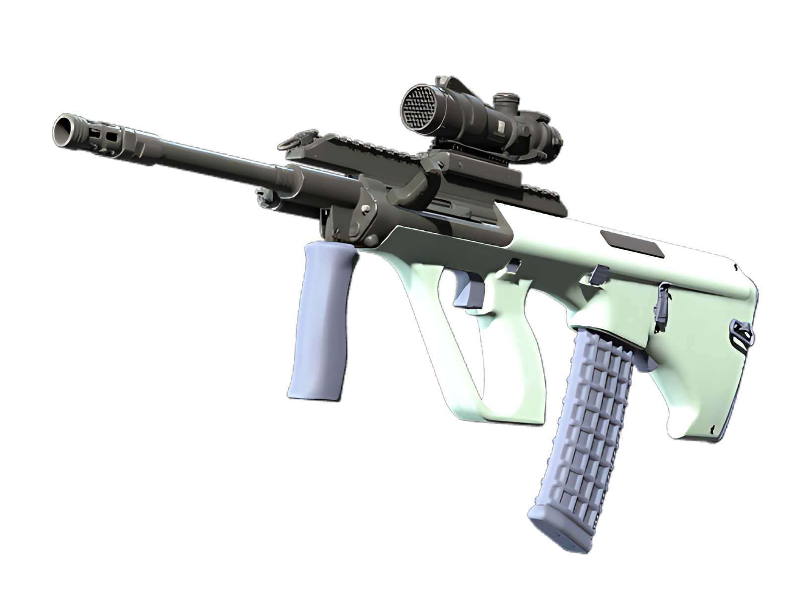
GRAPHIC STRUCTURE
The main body show the finish at its most readable: White provides the field, while Black sharpens the separation.
SECONDARY CONTRAST
Black is not just a secondary colour here; it acts as a visual break that keeps the dominant White from flattening the whole finish.
MATERIAL DEPTH
A mix of bright and shadowed areas gives the surface a tactile quality that pure colour blocking would not achieve. For Storm on AUG, this is part of the finish's specific visual balance.
PALETTE
 Black
Black
 Grey
Grey
 White
White
STYLE
 Minimalist / Clean
 Tactical / Industrial
MOOD
 Clutch / Cold-Blooded
 Defensive / Anchor
SKIN PROFILE
RATING

VERDICT
Efficient Pick Cot Cot!