CURATOR'S NOTE

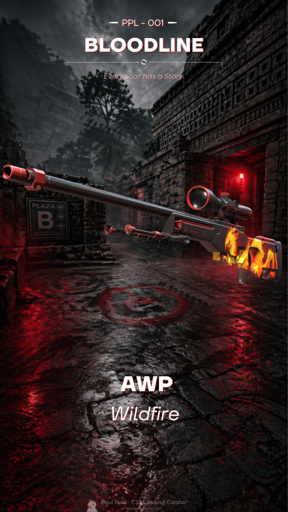
Wildfire feels deliberate because its expressive graphic treatment is supported by a clear hierarchy: Red first, Orange second, with Black used as an accent. That discipline is what makes the finish easy to build a loadout around.
DETAILS / CLOSE-UP

PRIMARY FIELD
The main body are where the expressive graphic treatment becomes most obvious, with Red and Orange working as a controlled two-colour system.
ORANGE COUNTERPOINT
The secondary Orange passages create pauses in the composition, which is important on a silhouette this long and segmented. For Wildfire on AWP, this is part of the finish's specific visual balance.
MATERIAL DEPTH
The expressive graphic treatment gains depth from the way highlights and darker recesses move across the render, preventing the palette from feeling flat. For Wildfire on AWP, this is part of the finish's specific visual balance.
PALETTE
 Black
Black
 Orange
 Red
Red
STYLE
 Artistic / Expressive
 Geometric / Pattern
MOOD
 Aggressive / Entry
 Flashy / Show-Off
SKIN PROFILE
RATING

VERDICT
Certified Cluckin' Banger!