CURATOR'S NOTE

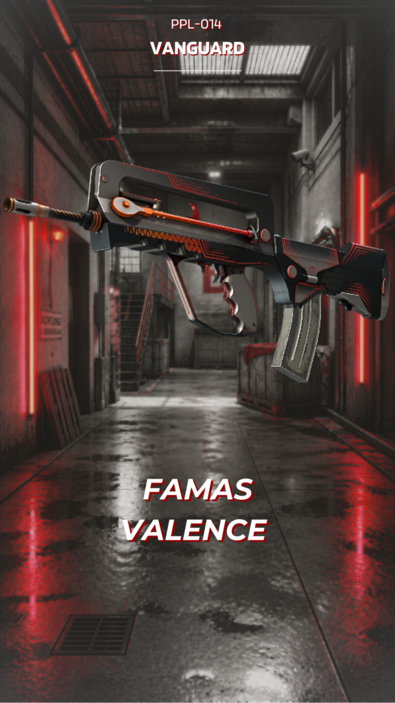
Valence feels deliberate because its controlled surface treatment is supported by a clear hierarchy: Black first, Grey second, with Red used as an accent. The visual hierarchy stays clear even when the pattern becomes busy.
DETAILS / CLOSE-UP

PRIMARY FIELD
The main body are where the controlled surface treatment becomes most obvious, with Black and Grey working as a controlled two-colour system. For Valence on FAMAS, this is part of the finish's specific visual balance.
COLOUR BREAK
Small changes between Black and Grey make the surface feel layered rather than uniformly coated. For Valence on FAMAS, this is part of the finish's specific visual balance.
EDGE DETAIL
The finish becomes more convincing in the smaller transitions, where colour, texture and unpainted structure meet. For Valence on FAMAS, this is part of the finish's specific visual balance.
PALETTE
 Black
Black
 Grey
Grey
 Red
Red
STYLE
 Minimalist / Clean
 Tactical / Industrial
MOOD
 Clutch / Cold-Blooded
 Stealth / Shadow
SKIN PROFILE
RATING

VERDICT
Efficient Pick Cot Cot!