
CURATOR'S NOTE

The appeal of Liquidation comes from how deliberately its surface treatment is distributed across the M4A1-S. Rather than spreading every colour evenly, the finish lets Blue dominate and uses Red to articulate the M4A1-S's major breaks. The result feels balanced and deliberate: recognisable at a glance, but detailed enough to reward a closer look.
DETAILS / CLOSE-UP
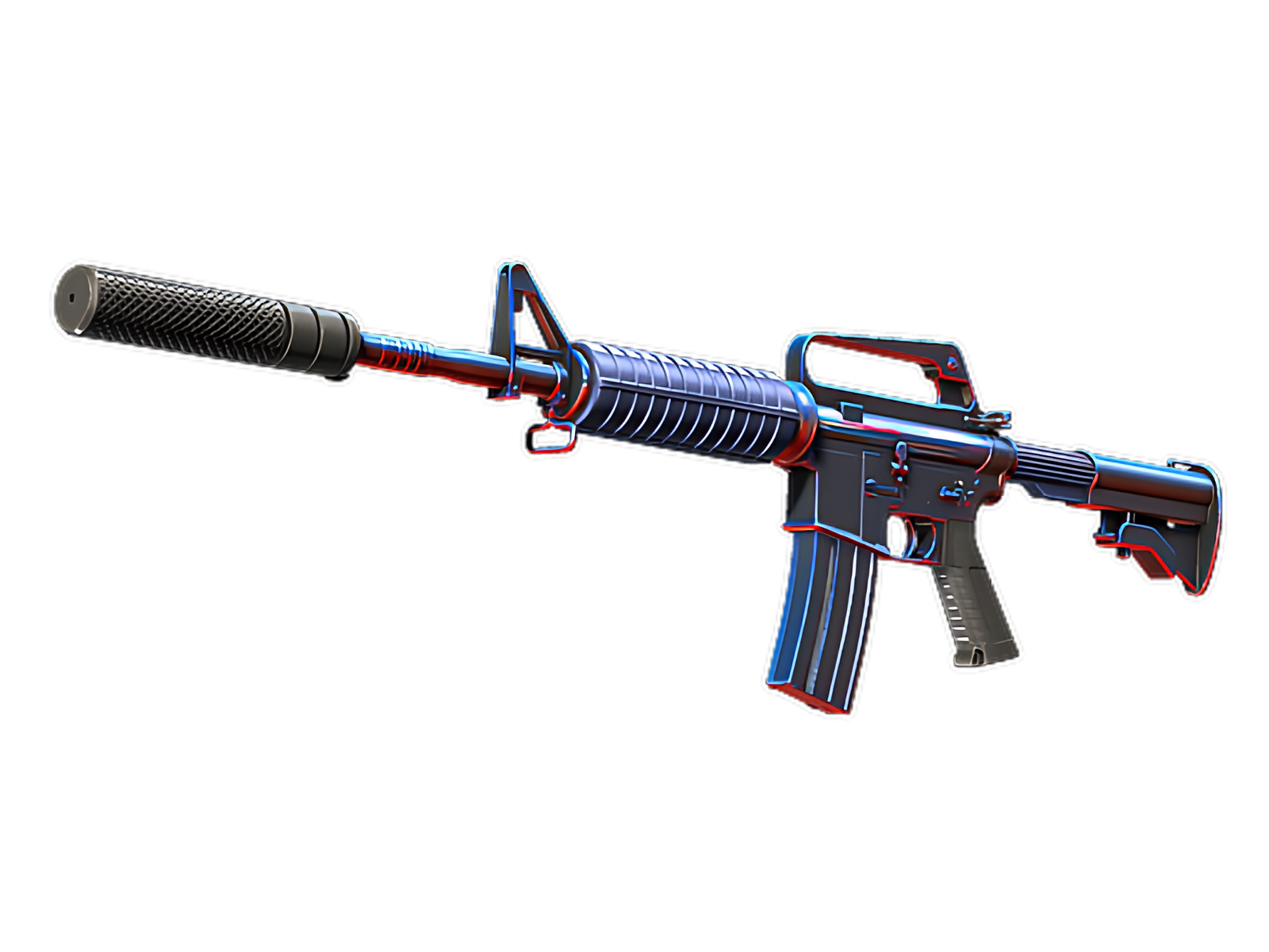
SURFACE FOCUS
Blue is most assertive on the receiver and handguard, turning that section into the visual anchor of Liquidation. The surface-specific graphic treatment is easiest to understand here.
STRUCTURAL BREAK
The stock and magazine introduce Red as a counterweight. On Liquidation, that shift prevents Blue from flattening the design and gives the painted and material contrast a more deliberate rhythm.
FINAL ACCENT
Near the suppressor and exposed hardware, the finish steps back. Black becomes the final accent, allowing the M4A1-S's physical construction to close the composition. On this M4A1-S, that role is specific to Liquidation.
PALETTE
 Black
Black
 Blue
Blue
 Red
Red
STYLE
 Artistic / Expressive
MOOD
 Clutch / Cold-Blooded
 Tactical / Playmaker
SKIN PROFILE
RATING

VERDICT
Efficient Pick Cot Cot!