
CURATOR'S NOTE

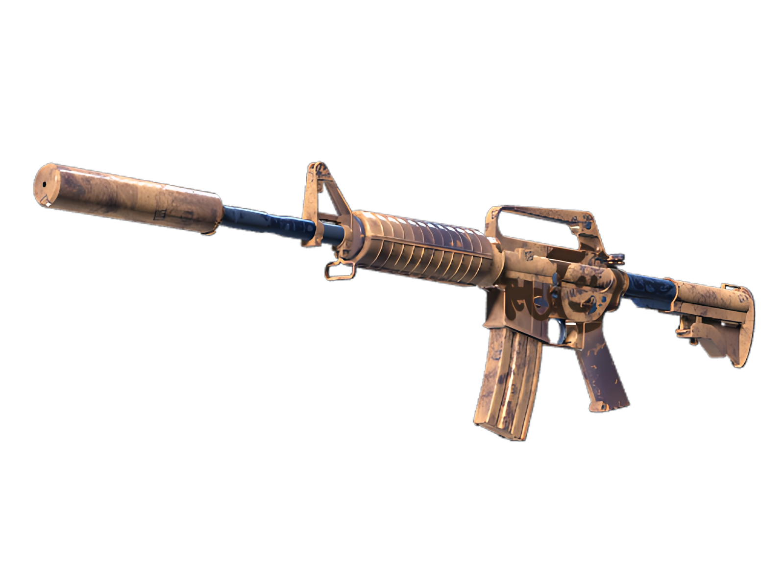
The appeal of Wash me plz comes from how deliberately its surface treatment is distributed across the M4A1-S. Here, Orange supplies the visual weight and Red gives the surface enough structure for the surface-specific graphic treatment to stay legible. It is the restraint between those elements—not sheer saturation—that gives the finish its character.
DETAILS / CLOSE-UP
PRIMARY FIELD
Orange is most assertive on the receiver and handguard, turning that section into the visual anchor of Wash me plz. The surface-specific graphic treatment is easiest to understand here.
SECONDARY RHYTHM
Moving into the stock and magazine, Red interrupts the main field just enough to separate the surfaces. That pacing is what keeps Wash me plz readable on the M4A1-S.
MATERIAL BREAK
The suppressor and exposed hardware act as a visual release point: Blue and exposed material reduce the density of Wash me plz and sharpen the boundary between finish and hardware.
PALETTE
 Blue
Blue
 Orange
 Red
Red
STYLE
 Artistic / Expressive
MOOD
 Clutch / Cold-Blooded
 Tactical / Playmaker
SKIN PROFILE
RATING

VERDICT
Efficient Pick Cot Cot!
FEATURED IN LOADOUTS
