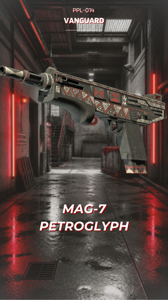
CURATOR'S NOTE

Petroglyph is strongest when you read it as a composition rather than a colour sample. The Black passages establish the first read, while Beige controls the separation between sections; the surface-specific graphic treatment provides the identity. It is the restraint between those elements—not sheer saturation—that gives the finish its character.
DETAILS / CLOSE-UP
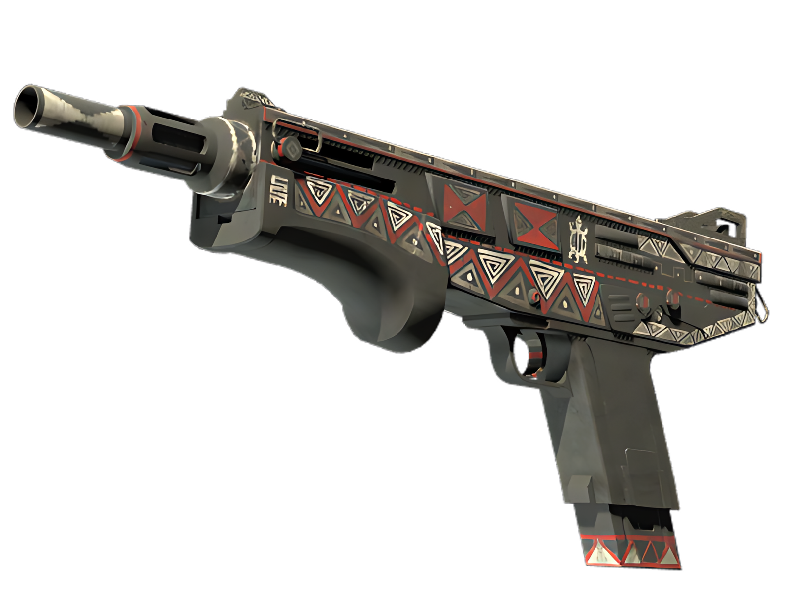
DOMINANT PASSAGE
Black is most assertive on the receiver shell, turning that section into the visual anchor of Petroglyph. The surface-specific graphic treatment is easiest to understand here.
PATTERN CONTROL
Moving into the fore-end and grip, Beige interrupts the main field just enough to separate the surfaces. That pacing is what keeps Petroglyph readable on the MAG-7.
MATERIAL DEPTH
The barrel, rail and rear hardware act as a visual release point: Brown and exposed material reduce the density of Petroglyph and sharpen the boundary between finish and hardware.
PALETTE
 Beige
Beige
 Black
Black
 Brown
Brown
STYLE
 Artistic / Expressive
MOOD
 Tactical / Playmaker
SKIN PROFILE
RATING

VERDICT
Efficient Pick Cot Cot!