
CURATOR'S NOTE

On the MP5-SD, Phosphor works through hierarchy: one visual idea leads, the rest supports it. Rather than spreading every colour evenly, the finish lets Blue dominate and uses Green to articulate the MP5-SD's major breaks. Nothing needs to be exaggerated; the palette and surface treatment already create a strong visual signature.
DETAILS / CLOSE-UP
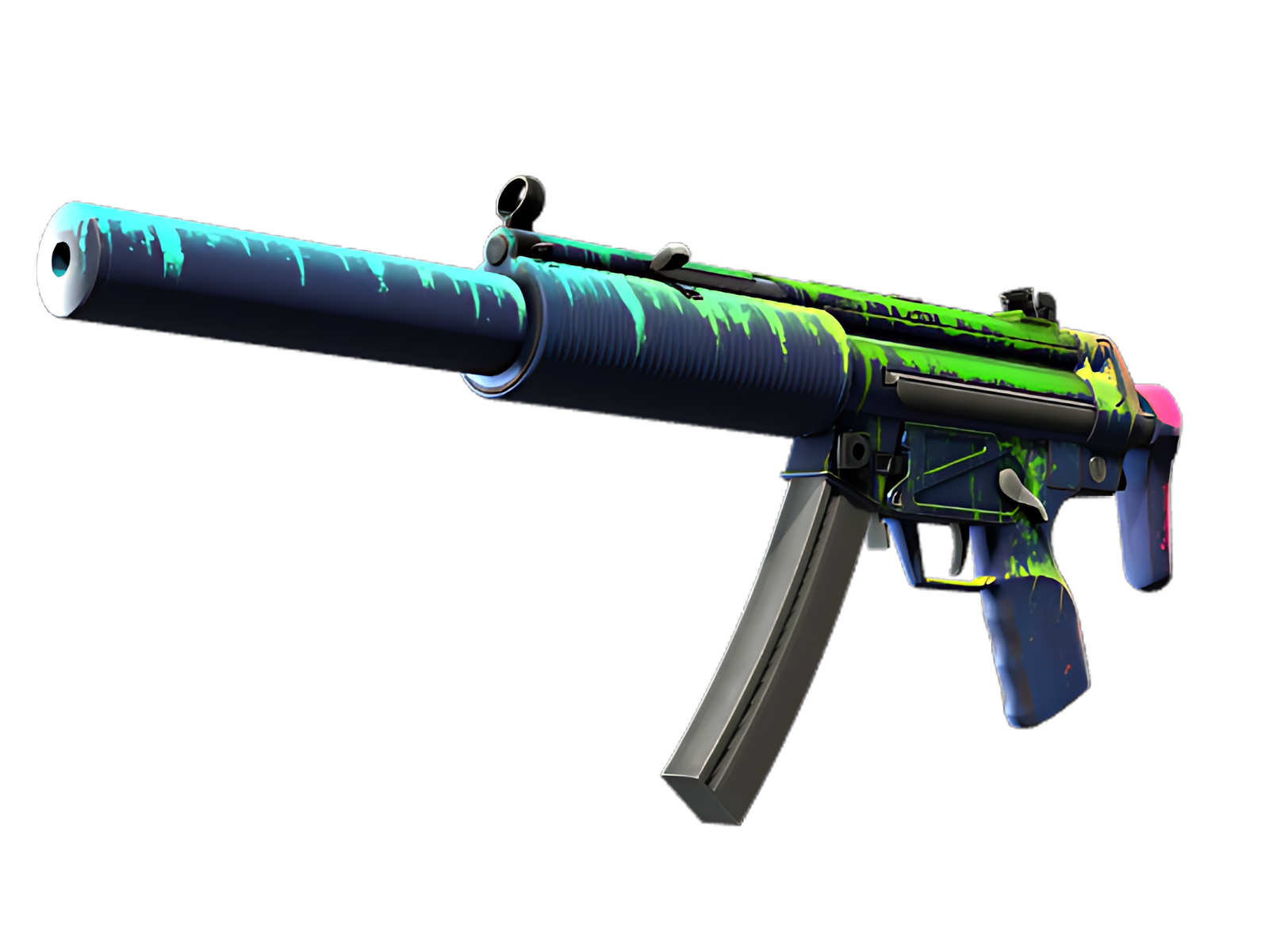
MAIN GESTURE
Blue is most assertive on the receiver and suppressor, turning that section into the visual anchor of Phosphor. The technical graphic language is easiest to understand here.
QUIETER SUPPORT
Along the handguard and magazine, Green creates the second layer of the composition. It breaks the Blue mass without weakening the finish's overall identity.
EDGE DETAIL
The stock and smaller controls act as a visual release point: Black and exposed material reduce the density of Phosphor and sharpen the boundary between finish and hardware.
PALETTE
 Black
Black
 Blue
Blue
 Green
Green
STYLE
 Futuristic / Cyberpunk
MOOD
 Clutch / Cold-Blooded
 Tactical / Playmaker
SKIN PROFILE
RATING

VERDICT
Efficient Pick Cot Cot!