
CURATOR'S NOTE

What makes Powercore convincing is the relationship between colour, material and the MP7's underlying geometry. Here, Green supplies the visual weight and Black gives the surface enough structure for the technical graphic language to stay legible. The result feels precise and engineered: recognisable at a glance, but detailed enough to reward a closer look.
DETAILS / CLOSE-UP
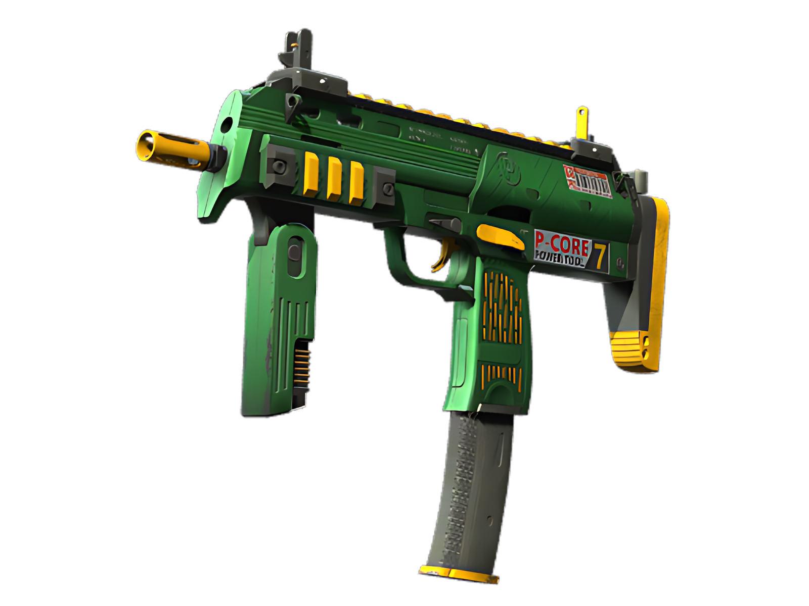
SURFACE FOCUS
Green is most assertive on the receiver body, turning that section into the visual anchor of Powercore. The technical graphic language is easiest to understand here.
STRUCTURAL BREAK
The foregrip and magazine introduce Black as a counterweight. On Powercore, that shift prevents Green from flattening the design and gives the synthetic painted surface a more deliberate rhythm.
FINAL ACCENT
At the stock, barrel and controls, Brown and the underlying construction become more visible. The quieter treatment frames the painted areas instead of competing with them. On this MP7, that role is specific to Powercore.
PALETTE
 Black
Black
 Brown
Brown
 Green
Green
STYLE
 Futuristic / Cyberpunk
MOOD
 Tactical / Playmaker
SKIN PROFILE
RATING

VERDICT
Efficient Pick Cot Cot!