
CURATOR'S NOTE

Candy Apple feels deliberate because its functional graphic treatment is supported by a clear hierarchy: Red first, Black second, with Grey used as an accent. The result is measured without losing visual control.
DETAILS / CLOSE-UP
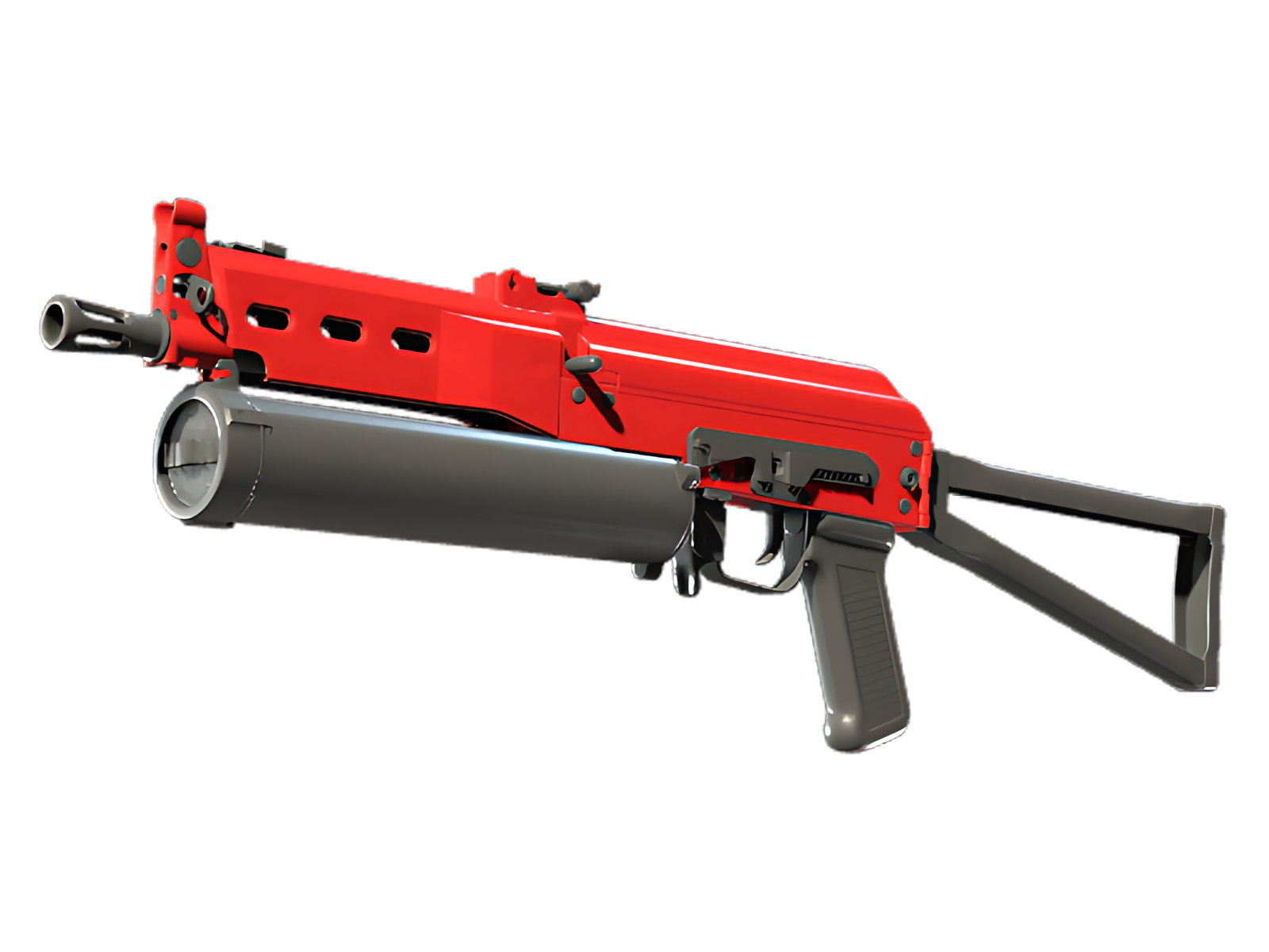
SURFACE RHYTHM
The main body are where the functional graphic treatment becomes most obvious, with Red and Black working as a controlled two-colour system. For Candy Apple on PP-Bizon, this is part of the finish's specific visual balance.
SECONDARY CONTRAST
Black is not just a secondary colour here; it acts as a visual break that keeps the dominant Red from flattening the whole finish. For Candy Apple on PP-Bizon, this is part of the finish's specific visual balance.
EDGE DETAIL
Edges, seams and hardware introduce enough material contrast to separate the graphic treatment from the underlying object. For Candy Apple on PP-Bizon, this is part of the finish's specific visual balance.
PALETTE
 Black
Black
 Grey
Grey
 Red
Red
STYLE
 Tactical / Industrial
MOOD
 Defensive / Anchor
SKIN PROFILE
RATING

VERDICT
Efficient Pick Cot Cot!