
CURATOR'S NOTE

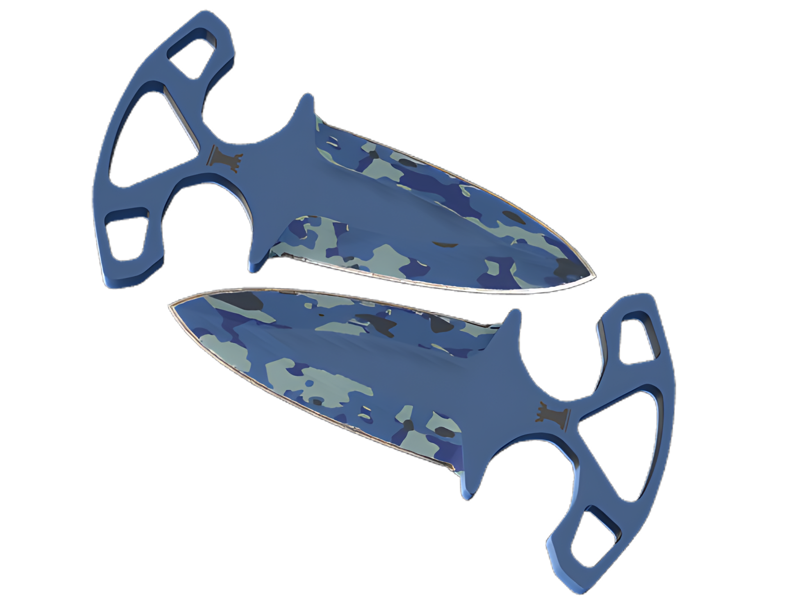
Bright Water changes the character of the ★ Shadow Daggers by treating its silhouette as part of the graphic design. The Blue passages establish the first read, while White controls the separation between sections; the cool aquatic patterning provides the identity. It is the restraint between those elements—not sheer saturation—that gives the finish its character.
DETAILS / CLOSE-UP
PRIMARY FIELD
Blue is most assertive on the twin blade faces, turning that section into the visual anchor of Bright Water. The cool aquatic patterning is easiest to understand here.
SECONDARY RHYTHM
Moving into the spines and cutting edges, White interrupts the main field just enough to separate the surfaces. That pacing is what keeps Bright Water readable on the ★ Shadow Daggers.
MATERIAL BREAK
At the handles and pommels, Black and the underlying construction become more visible. The quieter treatment frames the painted areas instead of competing with them. On this ★ Shadow Daggers, that role is specific to Bright Water.
PALETTE
 Black
Black
 Blue
Blue
 White
White
STYLE
 Artistic / Expressive
MOOD
 Clutch / Cold-Blooded
 Tactical / Playmaker
SKIN PROFILE
RATING

VERDICT
Mmh... This Egg is Pricey and Overcooked!