
CURATOR'S NOTE

The design language of Wintergreen can be summed up as dark grey base crossed by cool mint areas and progressive white lines, but the execution is what gives it depth. The mechanical interruptions are useful here: they make anodized cool-tone graphics feel installed, layered or applied with intent. It is the kind of finish that becomes more useful once you stop asking whether it is famous and start asking what visual role it can play.
DETAILS / CLOSE-UP
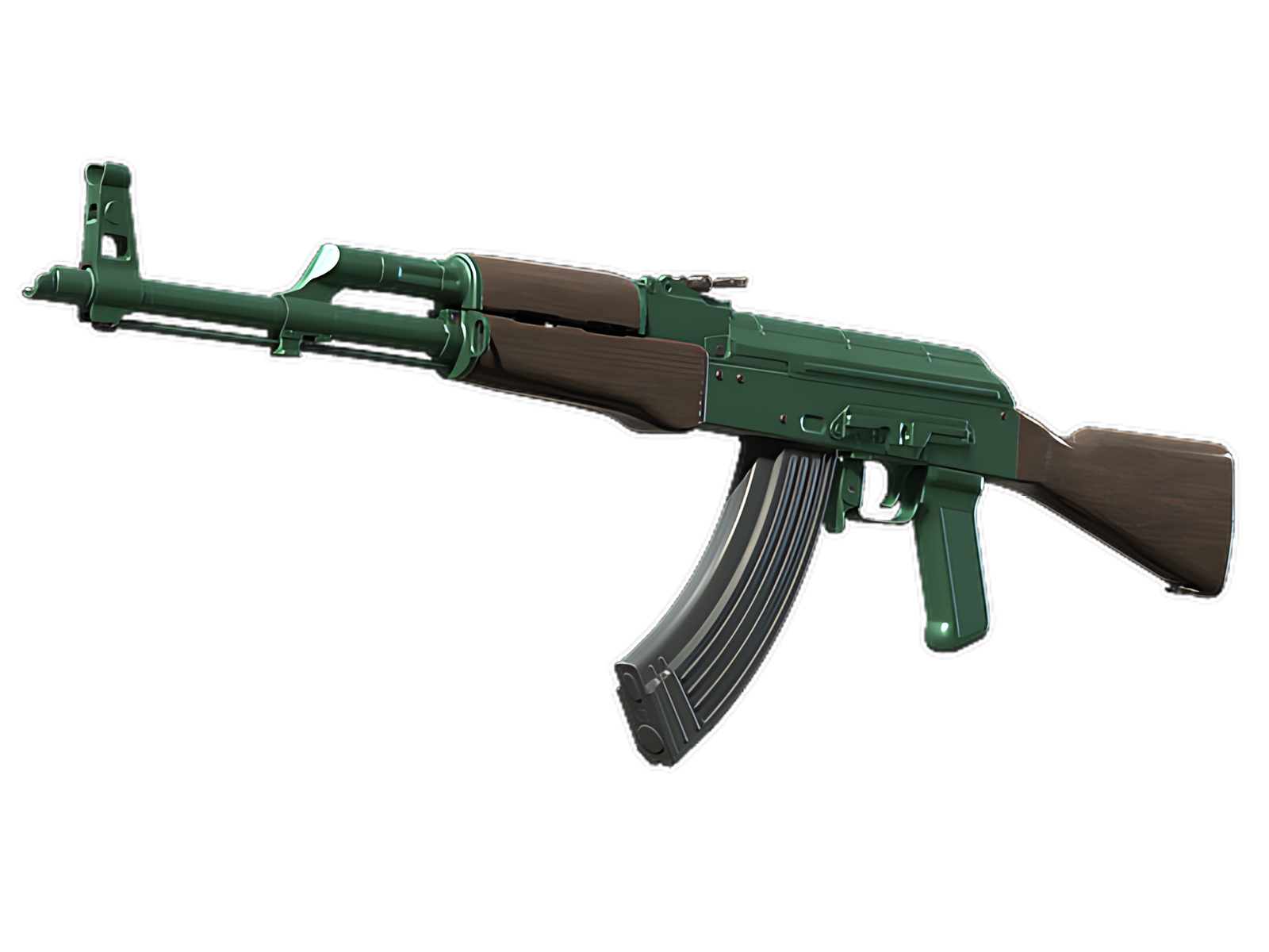
MINT ACCENTS
Mint accents. That one decision changes the perceived material of the weapon more than an extra illustration would.
WHITE STREAKS
White streaks. The visual effect is strongest where the motif meets an unpainted or darker component, because that boundary makes both sides clearer.
CHARCOAL FOUNDATION
Charcoal foundation. This zone carries enough weight to define the finish without asking every other section to be equally loud.
PALETTE
 Black
Black
 Brown
Brown
 Green
Green
STYLE
 Geometric / Pattern
 Minimalist / Clean
MOOD
 Clutch / Cold-Blooded
 Tactical / Playmaker
SKIN PROFILE
RATING

VERDICT
Efficient Pick Cot Cot!