
CURATOR'S NOTE

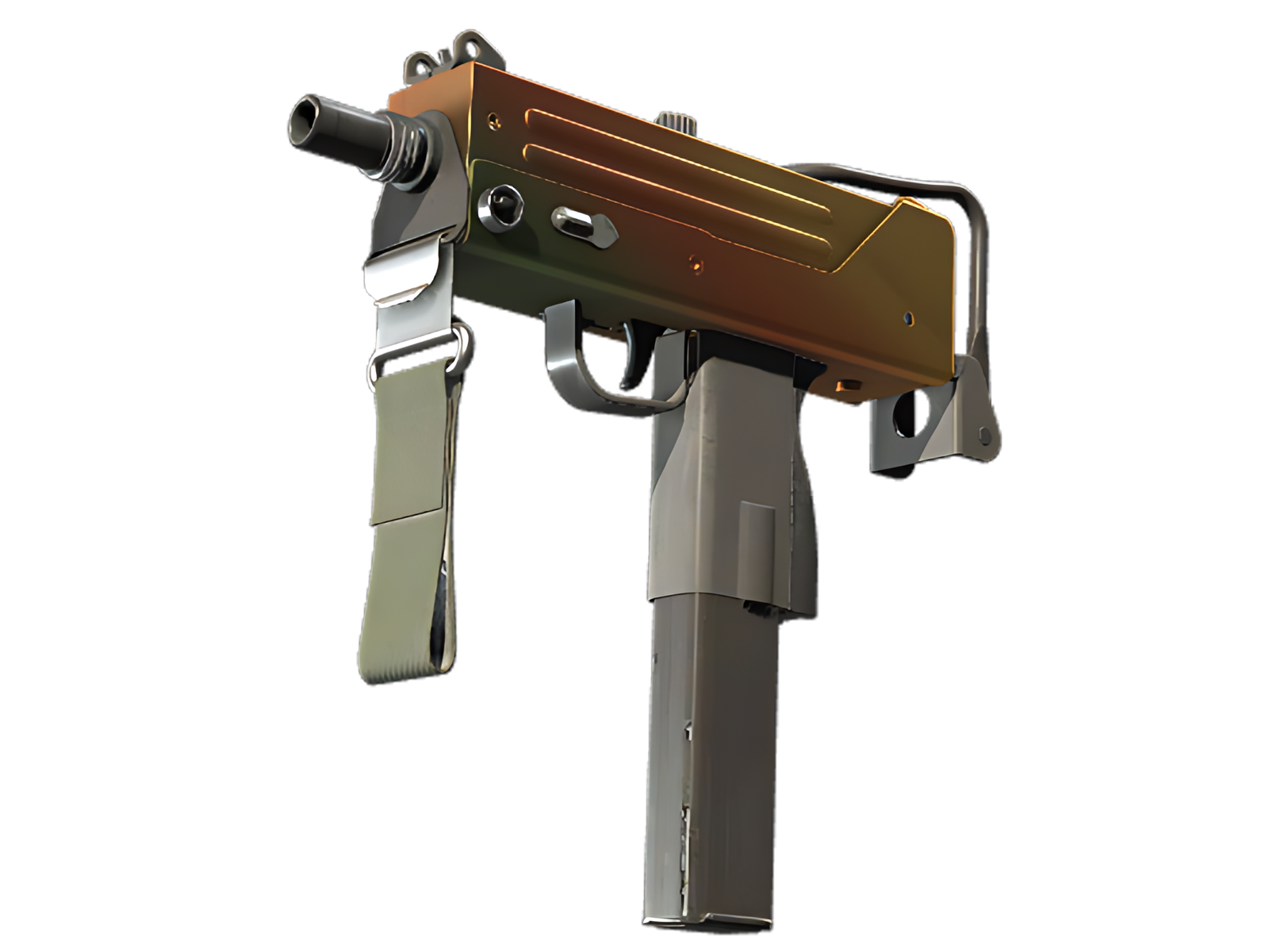
What makes Amber Fade convincing is the relationship between colour, material and the MAC-10's underlying geometry. The Orange passages establish the first read, while Yellow controls the separation between sections; the smooth colour gradient provides the identity. It is the restraint between those elements—not sheer saturation—that gives the finish its character.
DETAILS / CLOSE-UP
PRIMARY FIELD
Orange is most assertive on the upper receiver and body, turning that section into the visual anchor of Amber Fade. The smooth colour gradient is easiest to understand here.
SECONDARY RHYTHM
Along the grip and magazine, Yellow creates the second layer of the composition. It breaks the Orange mass without weakening the finish's overall identity.
MATERIAL BREAK
At the wire stock and front assembly, Brown and the underlying construction become more visible. The quieter treatment frames the painted areas instead of competing with them. On this MAC-10, that role is specific to Amber Fade.
PALETTE
 Brown
Brown
 Orange
 Yellow
STYLE
 Futuristic / Cyberpunk
 Minimalist / Clean
MOOD
 Clutch / Cold-Blooded
 Flashy / Show-Off
SKIN PROFILE
RATING

VERDICT
Efficient Pick Cot Cot!