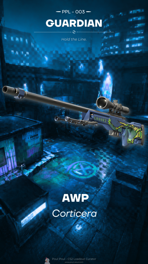
CURATOR'S NOTE

The first read of Corticera is colour: Blue leads, Black gives it structure, and the finish turns that contrast into expressive graphic treatment. It stays readable at a glance, yet rewards a closer look at the smaller transitions.
DETAILS / CLOSE-UP
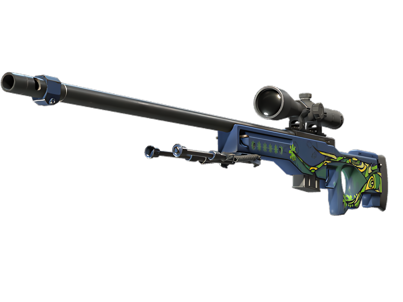
COLOUR BLOCKING
The main body show the finish at its most readable: Blue provides the field, while Black sharpens the separation. For Corticera on AWP, this is part of the finish's specific visual balance.
COLOUR BREAK
Black is not just a secondary colour here; it acts as a visual break that keeps the dominant Blue from flattening the whole finish. For Corticera on AWP, this is part of the finish's specific visual balance.
SURFACE DEPTH
The expressive graphic treatment gains depth from the way highlights and darker recesses move across the render, preventing the palette from feeling flat. For Corticera on AWP, this is part of the finish's specific visual balance.
PALETTE
 Black
Black
 Blue
Blue
 Grey
Grey
STYLE
 Artistic / Expressive
 Geometric / Pattern
MOOD
 Clutch / Cold-Blooded
 Defensive / Anchor
SKIN PROFILE
RATING

VERDICT
Finger Lickin' Clean!