
CURATOR'S NOTE

Crakow! feels deliberate because its functional graphic treatment is supported by a clear hierarchy: Pink first, Red second, with Purple used as an accent. The visual hierarchy stays clear even when the pattern becomes busy.
DETAILS / CLOSE-UP
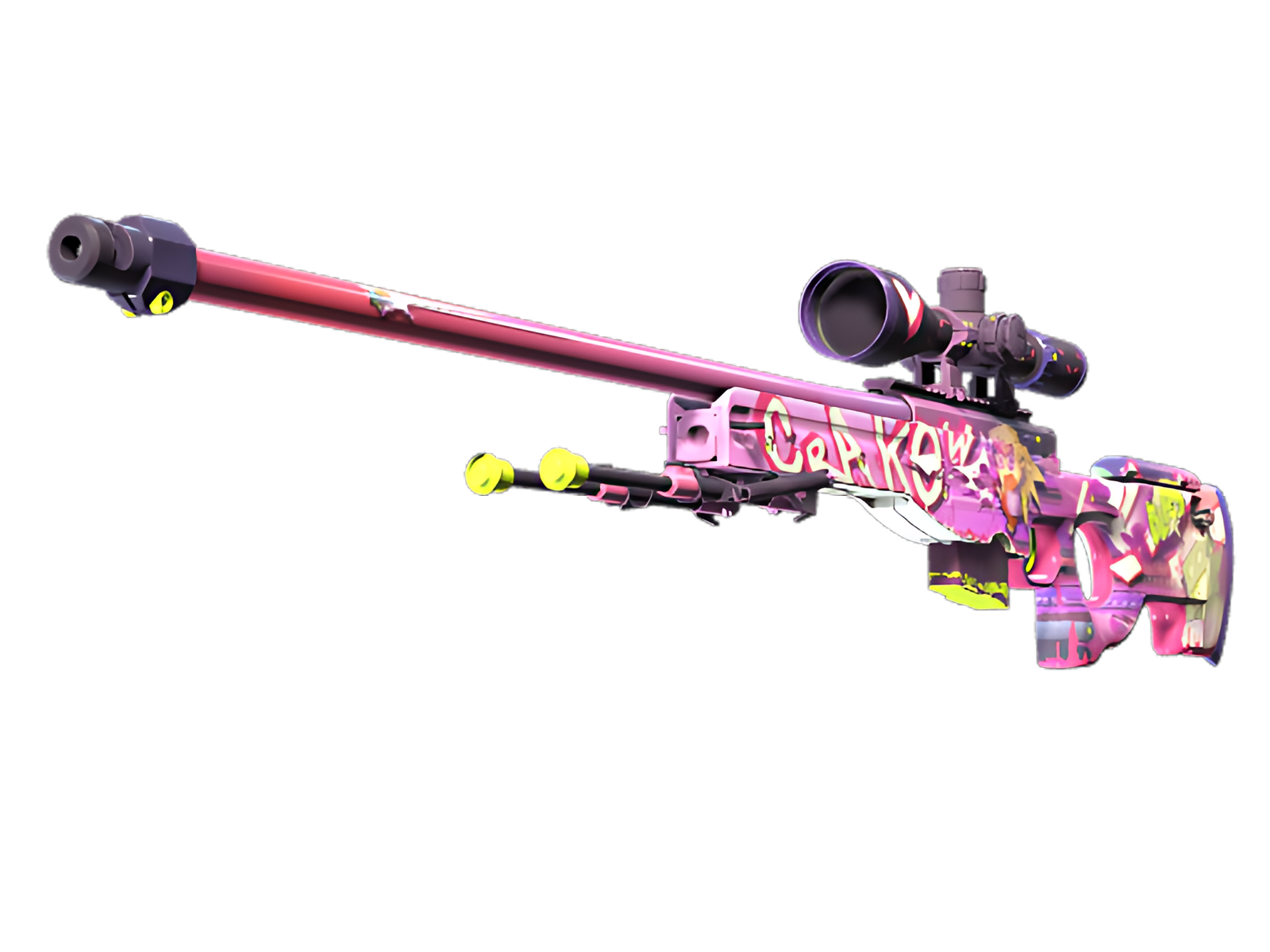
COLOUR BLOCKING
main body carry most of the Pink, establishing the finish's visual weight before the smaller Red areas interrupt it.
DARK STRUCTURE
The contrast between Pink and Red gives the finish its edge, especially where painted sections meet darker hardware. For Crakow! on AWP, this is part of the finish's specific visual balance.
HARDWARE CONTRAST
A mix of bright and shadowed areas gives the surface a tactile quality that pure colour blocking would not achieve. For Crakow! on AWP, this is part of the finish's specific visual balance.
PALETTE
 Pink
Pink
 Purple
 Red
Red
STYLE
 Tactical / Industrial
MOOD
 Aggressive / Entry
 Flashy / Show-Off
SKIN PROFILE
RATING

VERDICT
Finger Lickin' Clean!