
CURATOR'S NOTE

O.S.I.P.R. gives the M249 a clear identity without needing every section to compete for attention. The Black passages establish the first read, while Blue controls the separation between sections; the surface-specific graphic treatment provides the identity. That balance keeps the finish coherent from first read to close-up inspection.
DETAILS / CLOSE-UP
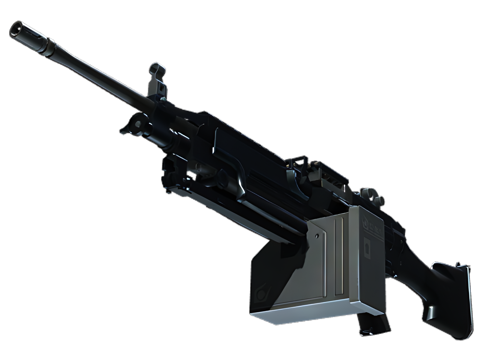
SURFACE FOCUS
Across the receiver and upper shroud, O.S.I.P.R. concentrates most of the Black. This is where the surface-specific graphic treatment reads most clearly and where the M249 gains its first visual anchor.
STRUCTURAL BREAK
The stock and magazine housing introduce Blue as a counterweight. On O.S.I.P.R., that shift prevents Black from flattening the design and gives the painted and material contrast a more deliberate rhythm.
FINAL ACCENT
At the barrel, bipod and exposed hardware, Teal and the underlying construction become more visible. The quieter treatment frames the painted areas instead of competing with them.
PALETTE
 Black
Black
 Blue
Blue
 Teal
Teal
STYLE
 Artistic / Expressive
MOOD
 Clutch / Cold-Blooded
 Tactical / Playmaker
SKIN PROFILE
RATING

VERDICT
Efficient Pick Cot Cot!