
CURATOR'S NOTE

What makes Fade convincing is the relationship between colour, material and the ★ Bowie Knife's underlying geometry. Here, Pink supplies the visual weight and Purple gives the surface enough structure for the smooth colour gradient to stay legible. Because the visual weight is controlled, the finish remains easy to place inside a curated loadout.
DETAILS / CLOSE-UP
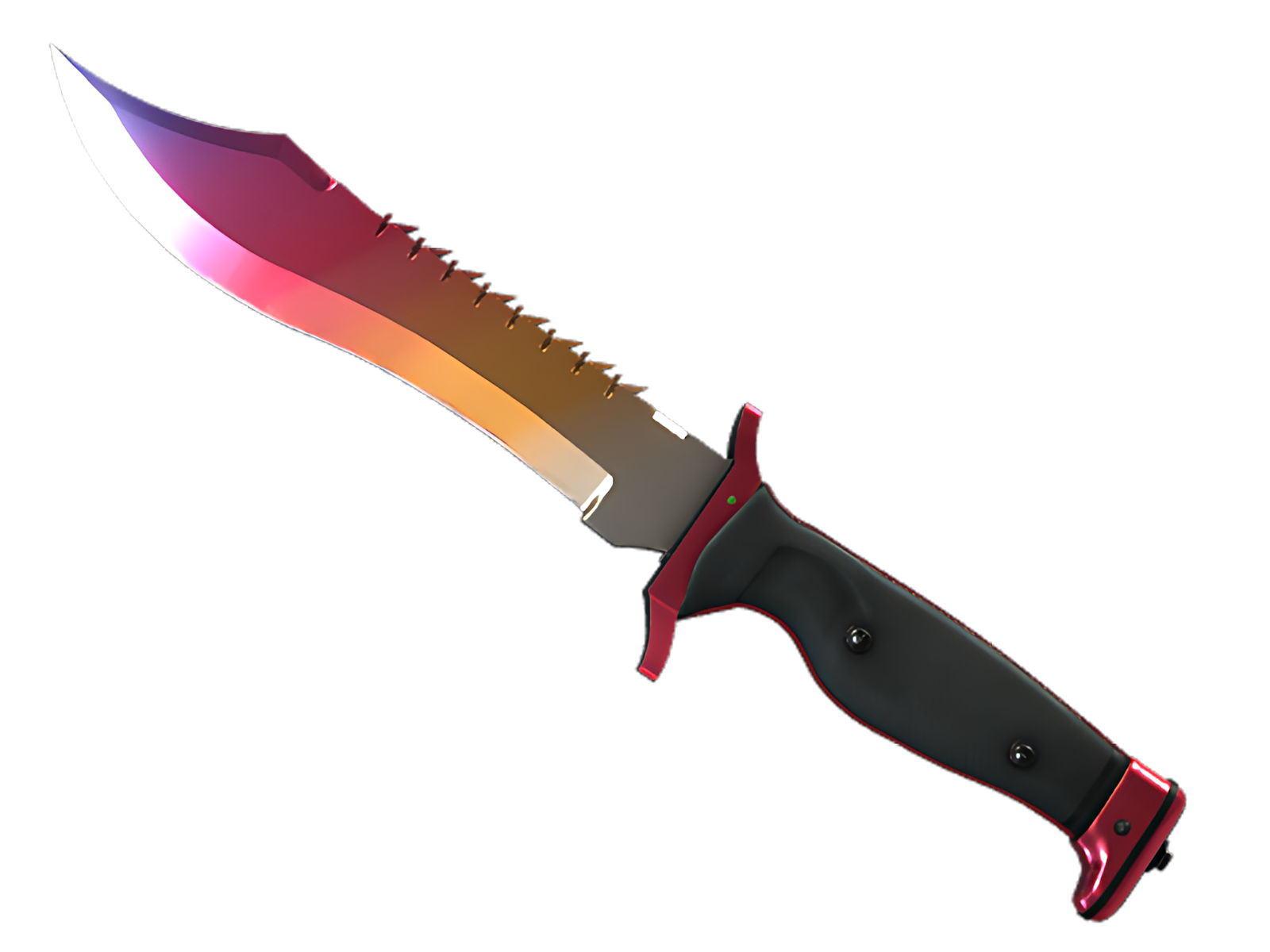
MAIN GESTURE
Pink is most assertive on the blade face, turning that section into the visual anchor of Fade. The smooth colour gradient is easiest to understand here. On this ★ Bowie Knife, that role is specific to Fade.
QUIETER SUPPORT
Moving into the spine and cutting edge, Purple interrupts the main field just enough to separate the surfaces. That pacing is what keeps Fade readable on the ★ Bowie Knife.
EDGE DETAIL
Near the handle and pommel, the finish steps back. Yellow becomes the final accent, allowing the ★ Bowie Knife's physical construction to close the composition. On this ★ Bowie Knife, that role is specific to Fade.
PALETTE
 Pink
Pink
 Purple
 Yellow
STYLE
 Futuristic / Cyberpunk
 Minimalist / Clean
MOOD
 Clutch / Cold-Blooded
 Flashy / Show-Off
SKIN PROFILE
RATING

VERDICT
Dripped Out in Feathers!